Homework - Fashion Illustrations
Channeled Style, Distilled & Critique
Fashion Illustration A


Source: Flickr
Annotation and Critique

I feel that this illustration captures a person quite well. There aren’t too many points of exaggeration to be seen, and the features of the person can be identified underneath the coat. Overall, it does look a little flat, given how you can’t really tell what’s underneath the coat around the chest and legs.
The only place where I thought there was a bit of style influenced was around the neck area. I feel it looks a little long, and the shoulders seem a bit narrow.
Fashion Illustration B


Source: Luxussilk’s Blog
Annotation and Critique

The artist’s style was very obvious in this illustration. The long body, with slender hips and long necks, really emphasises the dress. In terms of depicting a real, life-life person, I don’t think this illustration accurately portrays that. Although it is recognisable as a person.
I do believe that the artist has been able to show the volume and depth of the person through the colours and shading.
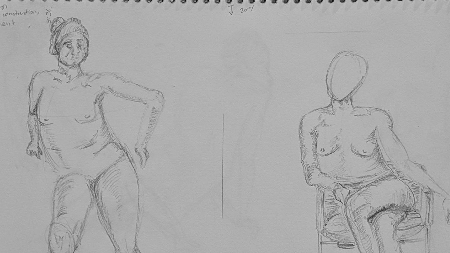
01 - Extended Seated Drawings
20 minutes per pose

The focus on this drawing was to get the gesture, construction and refinement layered. I started the drawing a little too close to the top, and didn’t include the chair the model was leaning on, making it look weirdly floating.
My next drawing attempted to provide more info in the scene, but I didn’t get enough time to complete the whole drawing. I feel like I’m making progress on the tone and shading aspects, in order to give my drawing some volume.
02 - The Longest Pose
35 minutes

With 35 minutes, there was ample opportunity to really drill in the detail into the drawing. This time I used a quick ‘triangle’ map to approximate the area that the model would take. I was quite pleased with the facial features in this drawing, as I usually don’t have time to add it in.
I had also added the platform the model was sitting on to ground my drawing. I think my shading really brought the drawing out a bit, although some areas of the drawing, notably the right hand side arm, looks a little off.